ShopDreamUp AI ArtDreamUp
Deviation Actions


Suggested Deviants


Suggested Collections


You Might Like…


Description
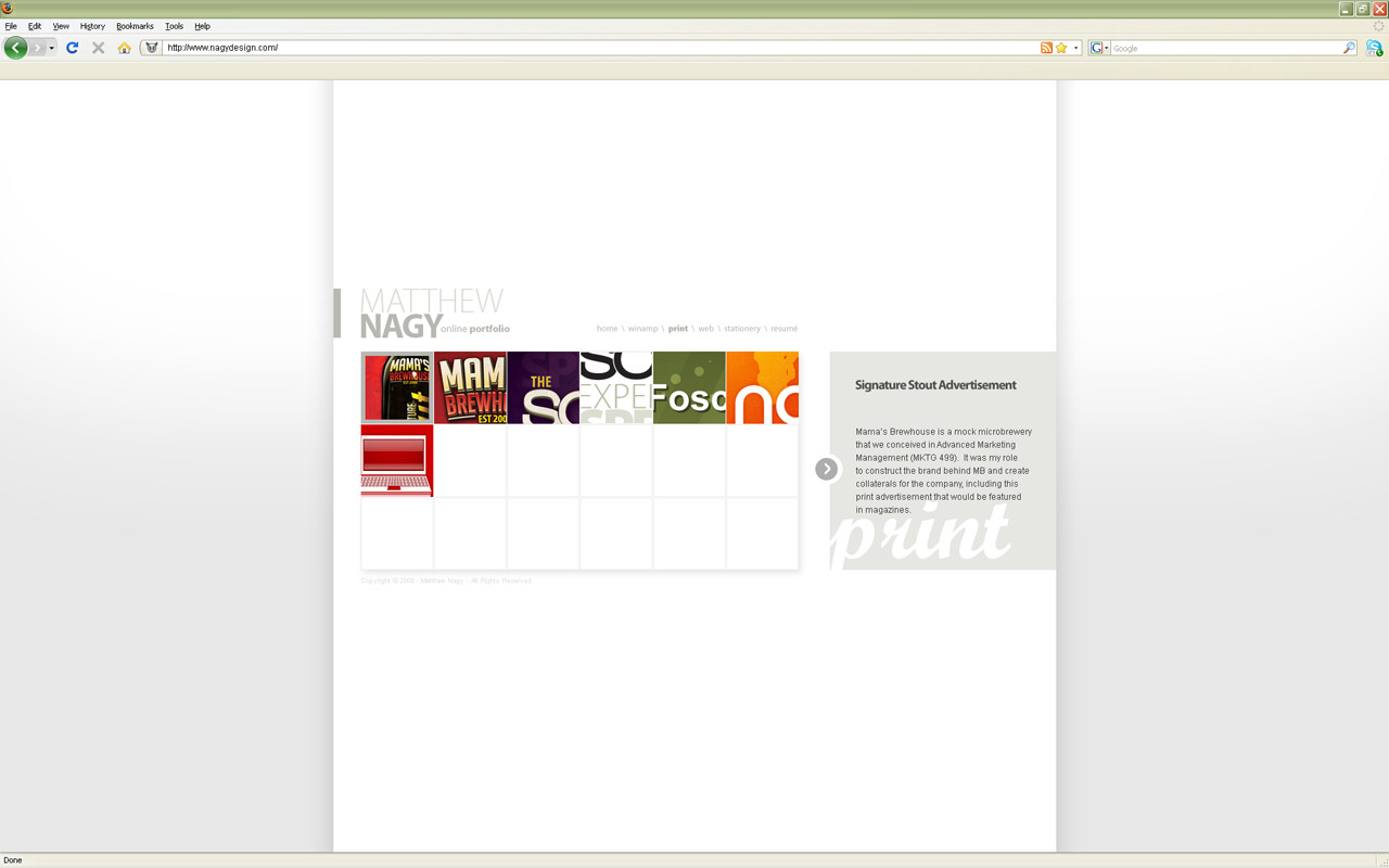
Working on my online portfolio. I would appreciate some critiques on this one, webdesign isn't my forté.
I decided to work with an actual browser window and submitted it this way in order to put the site in perspective.
I decided to work with an actual browser window and submitted it this way in order to put the site in perspective.
Image size
1280x800px 117.98 KB
Comments4
Join the community to add your comment. Already a deviant? Log In
Looks cool. But i have a hard time understanding why you are using the borders to define the site, when you are placing the content dead center. No offence, but it looks like someone took an a4 piece of paper and designed a site on it  (Wink)")
A: I'd drop the blog-look, and settle for a centered and more cropped design though
B: drop the gray dropshadows that define the sites edges, and intergrate the whole site in your background (maybe remove the gradient and just go for a full white). That way, the site will look more fluent and smooth.